|
|
Post by metalgearray09 on Mar 14, 2009 1:04:16 GMT -5
This goes out to any and all artists. It's quite simple: How do you start off drawing your figures/creatures/ect. Care to share?  |
|
|
|
Post by Mark Brooks on Mar 14, 2009 1:13:47 GMT -5
I tend to always start with the head and spine drawn as a simple oval and straight or curved line. the head is the guiding force of the body with the spine following right after so, once you have them like you'd like them, you can add the arms and legs.
|
|
lenneth4
Soldier
 Can't read my !!! can't read my !!!!no he can't read my poker face !!!!!!!
Posts: 50 
|
Post by lenneth4 on Mar 14, 2009 1:27:25 GMT -5
same , i begin with head but i saw some artist who began with foots lol.
i begin too with simple lines in order to see if the drawing is kinda solid or no...
|
|
|
|
Post by metalgearray09 on Mar 14, 2009 1:33:56 GMT -5
hm, well I'm trying different things but it all kinda..falls apart. If any of you have time, care to show some progress pics? Thanks.
|
|
|
|
Post by Littlegett on Mar 14, 2009 1:40:31 GMT -5
It really depends on what I want to achieve with my drawing. Though I have to say I mostly start with the face and build from there. Most recently I have started going back to creating contours of the drawing to block everything in before going back and rendering it all out one section at a time.
to bad we are not able to upload to the board.
|
|
piotrov
hanger-on
Peter Foglesong
Posts: 5
|
Post by piotrov on Mar 14, 2009 2:36:14 GMT -5
Yeah, if it's just a figure, I'll usually start with the spine and work out from there. If I start with an extemity (head, feet, hands), things are more likely to get out of whack.
I usually work really small though when I'm figuring things out - lots of tiny thumbnails before anything is set in stone, and then move on to details.
|
|
|
|
Post by swordpunk on Mar 14, 2009 4:42:32 GMT -5
Ok, Well I do mine the same way like the first 2 posters said. I normally don't work straight digital when working, but since I was working with multiple characters, I thought it be easier to edit and move around for composition purposes, to get things to look right. From the left is a basic layout of the way I want to put my characters in a certain pose, then the right is more fleshed out to represent the characters characteristics. Right now I'm stuck on the details because I suck at clothing and facial features, but this is some basic stuff for now. Note: These are characters from Black lagoon anime series. 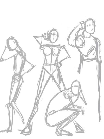 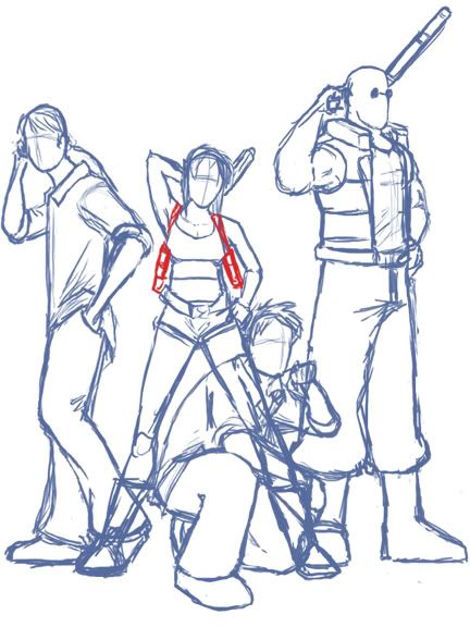 |
|
|
|
Post by chibinezu on Mar 14, 2009 9:06:16 GMT -5
I'm just regurgitating what everyone is already saying but definately the head circle first and then either a stick or block skeleton (depending on mood and pose itself) second.
I will almost never keep that head circle though, after I've blocked in the general body usually I find myself erasing it and moving it up or down or to the side.
|
|
|
|
Post by blaquejag on Mar 14, 2009 9:06:29 GMT -5
pretty much the same simple shape starting with head and out to the rest of the body. or I do some random free scribbling until something pops up.
|
|
Archerion
lieutenant
 Welcome to Eternity
Posts: 116
|
Post by Archerion on Mar 14, 2009 9:25:56 GMT -5
I used to skeleton , then shapes then render, but lately i been working more towards the concept artist style, as to block in shapes then render. Still hard to get used to.
|
|
riverredsox
hanger-on
As brave as a Sox fan in the Bronx.
Posts: 8
|
Post by riverredsox on Mar 14, 2009 12:50:43 GMT -5
I'm far from being a professional artist, but I always start with shapes. Circle for the head, square for the torso, long ovals for limbs... you get the picture.
|
|
|
|
Post by badcog on Mar 14, 2009 12:58:22 GMT -5
I usually start out with a simple overall frame and build from there.
|
|
|
|
Post by scottf on Mar 14, 2009 14:01:45 GMT -5
Hello I don't think I am pro, but I've had these files lying around for some time and thought I should put them to some use. I suppose if someone could benefit from them, then why not show them off, right?  I start out with an idea from the client. She had asked for me to convey whimsical imagery and immediately my mind went straight to nature (doesn't everyone's mind?). I sketched up what I imagined, below are a few of the other thumbnails I sent to the client for this particular illustration. Note: The last one was at a request from the commissioner - based around a french artists theme.  In this case, the blue skies one was chosen. For my own reasons, I decided to tweak with it - adding the cranes at the request of the commissioner - also the close up of the girl was a reason for me to draw a girls face (although I decided to remove it on some versions of the final piece. Solidifying the idea presented in the first image, I used this as a basis for the final line art.  Once I am done with the rough sketch, I print it out on 11 x 17 paper and transfer it over via light box - keep in mind that I just lightly block them in, I add all the details when the light is off. With this illustration - I drew each element on a separate piece of paper; ie: Clouds, Rock, Birds, girl, and close up. Normally I scan and stitch (600 DPI) but it being summer, I let Kinko's rape it with their scanners.  Here comes the fun part, Flatting! Pretty straightforward, I just use the lasso tool with anti-aliasing turned off and start filling in my color choices in the desired areas. When it comes to this process, I am a little anal retentive. As you can see, I set everything on their own layer. It may not be wise, because it takes up a lot of space and slows Photoshop down, but it's how I work.   Basic shading is next - adding textures to the wings of the birds, and the rock. Basic brushes are used to achieve the cell shaded rendering, along side a pack that I found on DA that are no longer up.  Building on the previous, I tweaked the clouds; removing the line art for them (seemed too rigid) and instead carved them out with the "Watercolor Loaded Wet Flat Brush". Around this step I add some layer styles (set to screen and overlay) to create more of an atmosphere. Another thing to take note of is that even this far into the illustration, I am still tinkering with the close up both in size and position.  Here is the final piece - all done. Played around with the levels (slightly). A great tool I use all the time is the photo filter - making a person or object less warm or more cool (or vice versa).  A few close ups - enjoy. Anyways, I hope that helps. I can't say that everything is AOK, I'm on a writing spur so the grammar may be off - but I hope that helps. |
|
|
|
Post by babybro on Mar 14, 2009 14:37:32 GMT -5
Wow, these are great. I have to agree with everyone in that I start with a circle for head and cylinders and blocks for the body, but I'm always drawing the body too big or too small so usually once I start the details, I erase the outlines anyway lol.
|
|
ark
hanger-on
Posts: 33
|
Post by ark on Mar 14, 2009 14:54:36 GMT -5
at the moment im only drawin portraits, so i hav limited body shape/pose skills. but as far as drawin faces i always start with the eyes, because its human nature to look a face in the eyes (even when its a drawing) so for me this has to hav the best detail and impact. then for the position of the other features of the face i reference from the eyes (e.g. nose is 1.5 eye in length).
the main problem with doin faces in this way is that the overall size of the head is hard to control as there is a tendency for it to end up being bigger or smaller than expected!!
hope that helps someone
|
|


