|
|
Post by swordpunk on Mar 14, 2009 17:54:55 GMT -5
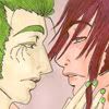
Well, I don't have a lot of work to show because I'm pretty much training myself still to be better and I am very picky how my work turns out so that's why. But here are the few I think are worthy of some exposure. Final Project for a class. Didn't get it as good as I wanted, but it came out pretty good considering.  Go Nagai's Devilman fanart. Pretty plain, but I like the way it turned out.  |
|
|
|
Post by swordpunk on Mar 16, 2009 3:27:29 GMT -5
Eh, it would be nice to get some feedback. I have 33 visits and no replies. It would be much appreciated  |
|
ark
hanger-on

Posts: 33
|
Post by ark on Mar 16, 2009 10:28:19 GMT -5
hey again, thought i'd repay the feedback!! lol. i said before i like the flow/action in the pose of the second one. as for the first one, i like the light from her hand reflected in the face of the monster, but im not sure about the focus of the pic. despite bein in the foreground and the light source, the girl is the one out of focus and im not sure it really works. i would have tried her in focus, and maybe only the eye of the monster in focus and the rest of the face fuzzed out a bit!! but great impact of the image overall, keep up the good work!! |
|
|
|
Post by swordpunk on Mar 16, 2009 11:32:20 GMT -5
Thanks man. Yeah, I got the same feedback from a friend a while back when I first posted the 1st pic on my DA page. I do have another version where everything is in focus. I just blurred it out from another version just to see if the out of focus thing would work. I still kind of like it, but I can how it's not really working.
|
|
ark
hanger-on
Posts: 33
|
Post by ark on Mar 16, 2009 12:33:26 GMT -5
i think its the light source in her hand thats the main problem coz the reflection on the face is brighter/sharper than the original source, without that i think it would work fine her bein out of focus!! but experimentin is wot its all about!
you should post a link to the other version too for a comparison!
|
|
|
|
Post by juggertha on Mar 16, 2009 20:15:36 GMT -5
I really like the girl pic (the one running at you), but am a bit put off by the fore shortening. The torso is great for it... the hand in the back beingsmall, the fist coming at you being much large... everything seems right. But when I pan down to the legs it seems a bit off. The foot in the foreground seems further ahead than the fist - and motion wise, that doesn't seem right to me.
|
|
|
|
Post by mistresslegato on Mar 16, 2009 23:59:48 GMT -5
I like them overall. Something, however, feels sort of unfinished about them. I'm not sure what it is!
|
|
|
|
Post by swordpunk on Mar 17, 2009 4:37:50 GMT -5
Thanks for the critiques. I'm glad it's not just me thinking that certain things are off on that lady piece and that it looks incomplete. I guess you can say that's my limit for now and just need to work a bit harder to get those things correct next time around.
The one with the face was rushed for an assignment for one of my classes, so I see what might be wrong with it, but considering it was one of my fastest pieces. I think it came out decent.
|
|