seraph
hanger-on
 Working away...
Posts: 41
|
Post by seraph on Mar 15, 2009 1:34:12 GMT -5
Hey, all. A few here. The first is a sketch I did of a facial tattoo for a character from City of Heroes. I just wanted to get the 'flow' of the tat down. The goal was to see how I could pull it over facial contours. The cheekbone area is fail. 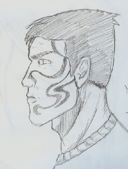 Second, is just a link due to it being rather large (800 pixels wide). img.photobucket.com/albums/v14/qualthis/pictures/Legion_In_Progress_by_Bleedingserap.jpg This one- pencils stage, relatively close to inking. Guess this isn't really 'sketch,' but the all around composition of the piece feels off. Placement, etc. Just unbalanced. This is also where I realized I tend to draw faces much less... 'Steve McNiven,' 'Jim Lee' and more cartoonish. And last, we have a concept I was doing for a character for a friend. 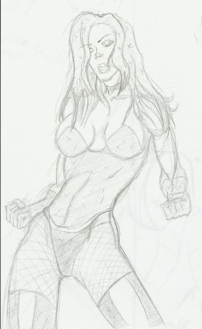 Thoughts? Hate mail? |
|
lenneth4
Soldier
Can't read my !!! can't read my !!!!no he can't read my poker face !!!!!!!
Posts: 50 
|
Post by lenneth4 on Mar 15, 2009 7:00:45 GMT -5
the last one , why not? but proportions are a bit wrong , the body of the girl is too long
try to mirror flip it
u gonna see what i mean( i hope)
|
|
|
|
Post by chargedgraphite on May 24, 2009 12:25:00 GMT -5
I agree. The female figure...shorten your rib cage design and tighten the abs to a smaller, more proportioned version. The abs should never be bigger than the fist. They are about half the size unless the character is a bruiser, which obviously isn't the case here.
Keep it up though...good start.
|
|

