|
|
Post by drewerd on Mar 17, 2009 22:02:06 GMT -5
Hello all, My name is Drew Moss and here is a piece I did for a couple kids in my son's Jow Ga Kung fu class. They asked for Blue Beetle and Batman because they love that new Brave and the Bold Cartoon. So I thought I would do an homage to the Brave and Bold #28  Oh yeah if you want to see more of my stuff you can go here www.drewerd.deviantart.com |
|
|
|
Post by juggertha on Mar 17, 2009 23:46:13 GMT -5
great subtle textures in the center of that thing.
|
|
|
|
Post by Action Bastard on Mar 18, 2009 2:21:40 GMT -5
cool
|
|
tyzue
hanger-on

Posts: 34
|
Post by tyzue on Mar 18, 2009 9:30:42 GMT -5
I love the coloring on this. What did you use? I like that Superman and Flash are making efforts to fight back. It would be better if Batman and Black Canary weren't in the same pose (mirrored). I think the picture shows variety and personality (aside from BC and BM poses being the same). Wow, the details on the creature is great. I love the textures, like Jugger said. I love the edges and the it wraps around each character. It feels "whole" instead of "flat", which is a problem I see in a lot of artists. I love the background also. It's simple enough that it doesn't take away the attention from the focus point, but it's enough that we know it's there and sets an appropriate mood. The simple coloring (on the bg) is also a plus. I'd say overall, you did a great job on the composition of this piece  |
|
|
|
Post by drewerd on Mar 18, 2009 10:08:19 GMT -5
I love the coloring on this. What did you use? I like that Superman and Flash are making efforts to fight back. It would be better if Batman and Black Canary weren't in the same pose (mirrored). I think the picture shows variety and personality (aside from BC and BM poses being the same). Wow, the details on the creature is great. I love the textures, like Jugger said. I love the edges and the it wraps around each character. It feels "whole" instead of "flat", which is a problem I see in a lot of artists. I love the background also. It's simple enough that it doesn't take away the attention from the focus point, but it's enough that we know it's there and sets an appropriate mood. The simple coloring (on the bg) is also a plus. I'd say overall, you did a great job on the composition of this piece Thanks guys I appreciate the kind words. I pencilled it on bristol,  inked it digitally with Sketchbook pro 9 and Photoshop 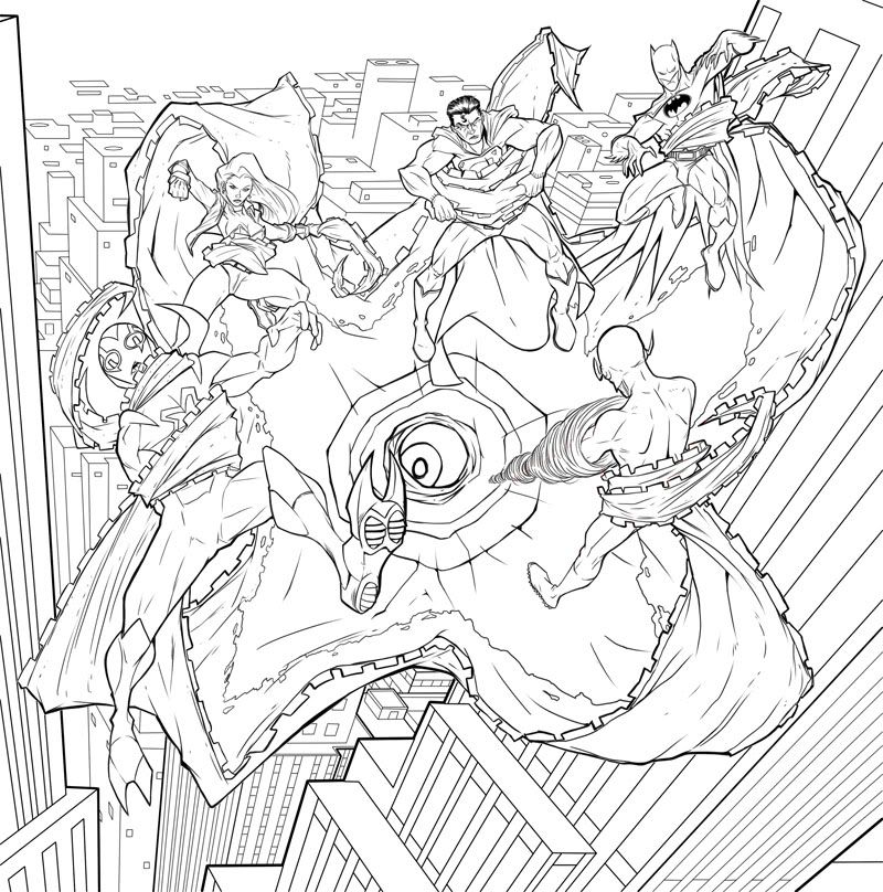 , and colored it in PS. |
|
tyzue
hanger-on
Posts: 34
|
Post by tyzue on Mar 18, 2009 10:15:43 GMT -5
ooooooooooooooooooooooo @_____@ <3 I'm a sucker for inprogress shots. They look great  |
|
comixink
hanger-on
What are we if not monsters?
Posts: 49
|
Post by comixink on Mar 23, 2009 22:19:04 GMT -5
Really happy to see you on here Drew! Love the StarO, the color work is great and the lines are solid as always. The background is a little off to me, maybe it's just me, but the horizontals seem too horizontal, maybe adding one more vanishing point wouldn't hurt. Great job on the Beetle, he looks great!
|
|