|
|
Post by drawnblud on Mar 19, 2009 5:51:27 GMT -5
|
|
|
|
Post by drewerd on Mar 19, 2009 13:10:17 GMT -5
Great work  I really like the last piece. With the textures and pulpy feel. Awesome |
|
|
|
Post by drawnblud on Mar 19, 2009 17:06:39 GMT -5
Thanks! That piece is one of my favorites too. I've always had an affinity for those old pulp magazines and comics!
|
|
Archerion
lieutenant
 Welcome to Eternity
Posts: 116
|
Post by Archerion on Mar 21, 2009 8:00:47 GMT -5
Very nice one think i would like to say is watch your lightsources. The last one is fantasic tho!
|
|
|
|
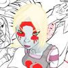
Post by chargedgraphite on Mar 21, 2009 13:33:02 GMT -5
Looks really good. Check into lightening up your color selection though...darker doesn't always mean better. You are showing signs of washing out your images in the shadowing meshing too well with your dark color selections. Go brighter across the board and shade with one scale darker, don't got SO dark and you'll give the same effect without the blurring issue.
If it is a night shot, then go darker and richer with the color and stay away from the grays as your choice of darkening the tone. Use your color pallette scaling tools in photoshop to darken the color more naturally.
You have a great base image in all of these but you smother it in the artificial shadowing. Check out Mark's work and others like him for examples of what I mean...especially the Iron Man he did for the Con program...Outstanding stuff as always.
Overall, it'sa good job though...nice work.
|
|
|
|
Post by drawnblud on Mar 21, 2009 17:18:06 GMT -5
Wow! Thanks a lot for the advice:) I've always struggled with light sources and recently I've begun using Poser to try and correct that. Thanks again for the advice, I really appreciate it:)
|
|