comixink
hanger-on
 What are we if not monsters?
Posts: 49
|
Post by comixink on Apr 5, 2009 18:25:15 GMT -5
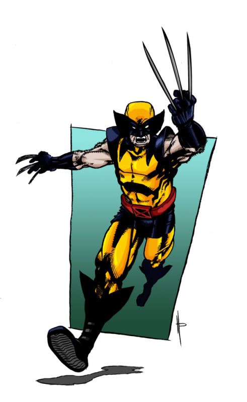 because color is good for ya. |
|
|
|
Post by nayias on Apr 5, 2009 23:20:03 GMT -5
Wow, dark Wolvie is dark... I think the colors are spot-on for his 90s costume, but the shading is dark enough to where it's really noticeable and distracting, I find myself squinting to try and see what's there..
Ah, I see.. It's mainly the blue-blacks that that's affecting, and his right-hand claws.. Iiiiisee... Hmm, maybe if the blues were a little brighter in there, it wouldn't be as noticeable.
But then again, I haven't actually tried that inline color myself, so I could be wrong.
|
|
comixink
hanger-on
What are we if not monsters?
Posts: 49
|
Post by comixink on Apr 6, 2009 0:05:53 GMT -5
Nayias I think its your monitors settings because mine isn't doing that, check it to make sure.
|
|
|
|
Post by chargedgraphite on Apr 11, 2009 14:52:47 GMT -5
Nah, it's not his monitor...heh. It's too dark. You've gone overkill with the black and it made it look flat and washed. Not bad on the yellows but man, those blues and blacks run together something fierce.
|
|
|
|
Post by nayias on Apr 16, 2009 4:22:10 GMT -5
Yup, got a brand spanking new monitor, and it's still super dark.. That's okay though, that's how we learn, neh?  Rock a Google Images Search on Wolverine, and you'll find plenty of references to how those blues look. I think you've got the basic premise, you just added the blues to the blacks, rather than the opposite. I think if you started out with a flat blue on those areas, you could then add shades of black (not straight black, maybe 60-75%) and get the desired blue "sheen". You probably wouldn't have to mess with any of the yellow shading, but you could lighten his right hand claws along with the blue-blacks. Or not, it's your piece after all, and if you're satisfied, sweet! It still looks great, it's just those tricksy inline shading techniques that are a littel distracting... |
|
sato
hanger-on
'I'm not wearing hockey pads'
Posts: 49
|
Post by sato on Apr 16, 2009 15:40:15 GMT -5
I actually like what you did with the colors, though that's just me. I like the contrast between the blacks, dark blues and the yellow.
|
|