|
|
Post by melrains on Apr 18, 2009 12:46:25 GMT -5
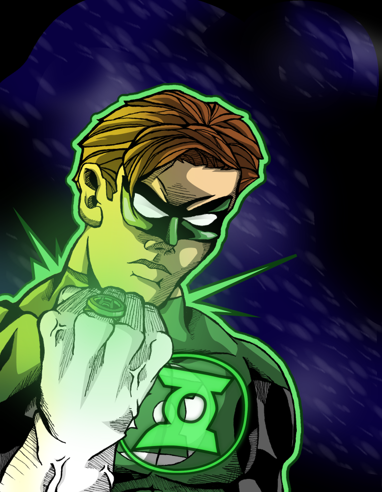 This was a piece I did earlier this year. This wasn't about proportions and layout so much as it was about trying different coloring techniques. I posted it on deviantArt to nary a comment, so if there are any colorists out there who would lie to give me some advice, I'm all ears. |
|
|
|
Post by theartslave on Apr 19, 2009 15:06:18 GMT -5
Have you tried doing the ring's light effects on it's own layer set to "screen"? It makes the colors glow and lighten up a bit. I mention this because the green glow from his ring is kinda dark (I know that sounds weird) and looks like paint, instead of light. That's my only crit. I love the way you handled the hair, which is not easy. The background is very cool as well. All your colors show up against the black line work very well, which is something a lot of rookies forget to observe. One last tiny thing: the grey on his outfit could use another lighter value, IMO. Nice work!!
|
|